Your Site Looks Fine on Desktop but Breaks on Phone: Here’s Why
Most of your visitors will never see the version of your site you tested. Here’s why “it looks fine on my computer” is exactly the wrong thing to check first.

Photo: Unsplash
Most small business owners look at their own website on a desktop or laptop — where it was probably designed, and where it usually looks fine. Most of their actual visitors are on a phone. That mismatch is exactly how a website can look perfectly professional to its owner while quietly failing everyone else.
Why this happens

Most older or template-based sites were designed desktop-first: a wide layout was built, and a “mobile version” was bolted on afterward through responsive breakpoints that shrink things down, rather than a layout actually designed for a small screen from the start. Page builders make this worse — they’re built around dragging elements onto a wide canvas, and the mobile preview is often an afterthought that gets checked once, if at all, before launch.
The specific ways sites break on phones
- Text too small to read without pinching and zooming.
- Buttons and links packed too close together, so the wrong one gets tapped.
- Horizontal scrolling that shouldn’t exist — content wider than the screen.
- A menu that doesn’t open, or opens and covers the whole screen with no visible way to close it.
- Images that overflow or don’t resize to fit the screen at all.
- Forms that are painful to fill out — tiny fields, no proper keyboard type for email or phone inputs.
- Popups that can’t be closed on a small screen because the close button is off-screen or too small to tap.
Why “it looks fine on my phone” isn’t proof

Checking a site on your own phone tests exactly one screen size, one operating system, and one browser. Visitors arrive on a huge range of devices — different screen widths, iOS Safari versus Android Chrome, older phones with smaller screens — and a layout that happens to work on your particular phone can still break for a meaningful share of everyone else.
Google’s mobile-first indexing
Since completing its shift to mobile-first indexing, Google primarily uses the mobile version of a page’s content to understand and index a site — not the desktop version. In practice, this means the mobile experience isn’t a secondary concern for search visibility; it’s the version that matters most for how Google reads your site in the first place. This isn’t a promise about rankings — it’s simply how the indexing mechanism itself works today.
How to actually check
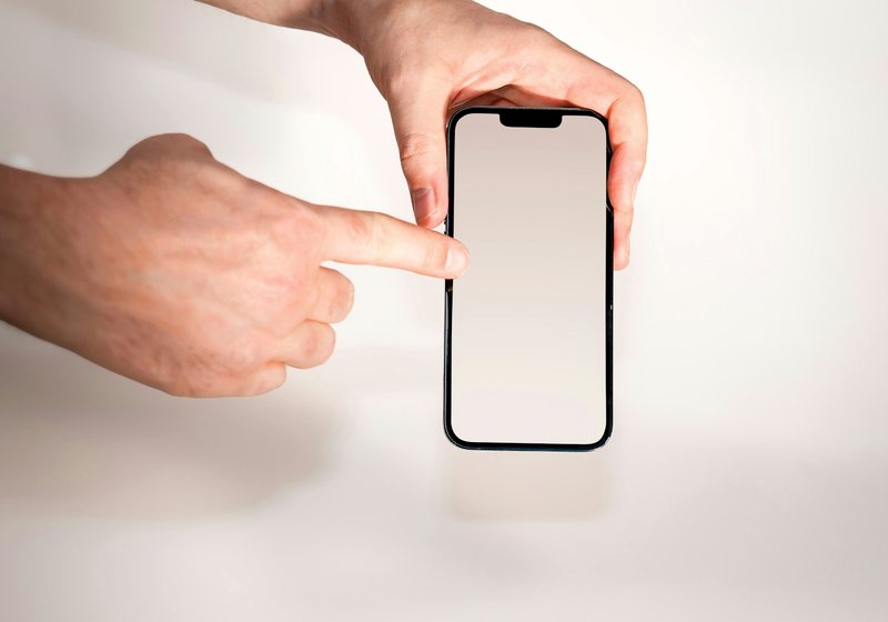
- Test on an actual phone, on mobile data, not just wifi — the closest thing to a real visitor’s experience.
- Use your browser’s device toolbar (built into Chrome, Firefox and Safari’s developer tools) to simulate several different screen widths quickly, without needing multiple physical phones.
- Check Google Search Console’s Mobile Usability report, if the site is connected — it flags specific pages with mobile problems Google has detected directly.
What to do about it
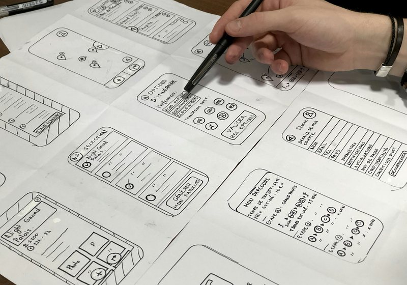
A handful of small mobile issues on an otherwise solid site are usually worth fixing directly. If the problems are systemic — a layout that fundamentally wasn’t built with small screens in mind — the more durable fix is a site designed mobile-first from the start, where the phone layout is the actual design, not a shrunk-down afterthought. See the cost breakdown for either path in our website cost guide.
See what mobile-first actually looks like
Every site in our portfolio is designed mobile-first from the ground up — see real examples across six industries.
See the portfolio →Frequently asked questions
Why does my website look fine on my computer but bad on my phone?
Most likely because it was designed desktop-first, with the mobile layout added afterward as a shrunk-down version rather than genuinely designed for a small screen. Testing only on a desktop hides exactly the problems mobile visitors experience.
Is checking my site on my own phone enough?
Not fully — it only tests one screen size, one operating system, and one browser. A layout that works on your particular phone can still break for visitors on different devices. Browser dev tools or Google Search Console’s Mobile Usability report give a broader picture.
What is Google’s mobile-first indexing?
It means Google primarily uses the mobile version of a page to understand and index its content, not the desktop version. It’s a statement about how indexing works, not a promise about search rankings — but it does mean the mobile experience is the one that matters most for how Google reads your site.
What are the most common mobile website problems?
Text too small to read without zooming, tap targets packed too close together, unwanted horizontal scrolling, menus that don’t open properly, and popups that can’t be closed on a small screen.
Should I fix mobile issues or rebuild the site?
A handful of isolated issues are usually worth fixing directly. If the problems are systemic — the layout fundamentally wasn’t designed for small screens — a mobile-first rebuild tends to be more durable than ongoing patches.
Get a fixed-price quote for your new website
Send us your current site and we’ll tell you honestly how it performs on mobile — plus a fixed-price quote for a mobile-first rebuild.
- Fixed price from $149
- Live in 3 days
Published by Union Web Studio, a trading name of Infivion LLC. Package details reflect our own published pricing as of August 2026 — see current pricing on the pricing page.